Tutorial: Stripe.com's main navigation
9 min read. Learn about performant web animations using CSS transforms.
Welcome! This is a post in my Dev series, where I attempt to explain and recreate interesting front-end dev techiniques I run across on the web.
In this post, we'll recreate the main navigation (see movie above) from Stripe.com. What's unique about this nav is that the popover container morphs to fit the content. There is an elegance to this transition versus the traditional behavior of opening and closing a new popover entirely.
Let's start by tackling what is probably going to be the hardest part of the exercise, animating the box while simultaneously switching the content.
Part 1: Animating the box
Using width and height transitions
One way to animate the box would be to use CSS transitions to smoothly move between width, height, and left values. In the live example below, we're toggling the .next class on and off the box every second.
.box {
  left: 20px;
  width: 390px;
  height: 240px;
  transition: all 0.4s;
}

.box.next {
  left: 140px;
  width: 240px;
  height: 180px;
}
See the Pen Stripe - Main Navigation 1.0 - Animating width and height by Lokesh Dhakar (@lokesh) on CodePen.
Beware of jank. This looks like what we want on the surface. But there is one problem. We're making the browser do extra work on the main thread, and this puts us at risk of creating slowdown in our animation and having the browser drop below 60fps and feel sluggish.
So what's the culprit? Animating width, height, or any of the position values, like top or left, forces the browser to run it's Recalculate Style process, and this CPU-expensive process needs to run on every frame where the value changes.
Thankfully, there is a more performant way to do this animation...
Using transforms
The rule of thumb for creating performant animations on the web is to use the transform and opacity CSS properties. The browser is able to animate both of these properties cheaply. It does this by offloading the work from the main thread to the GPU. We'll see what this looks like under the hood later.
Let's look at transform a little closer. It's particularly handy as it can replace multiple other CSS properties that are less performant in animations:
width  -> transform: scaleX()
height -> transform: scaleY()
top    -> transform: translateY()
left   -> transform: translateX()
Let's update our previous demo to use transform:
.box {
  width: 390px;
  height: 240px;
  transform-origin: 0 0;
  transition: transform 0.4s;
}

.box.next {
  transform:
    translateX(120px)
    scaleX(calc(240 / 390))  /* scaleX(0.61) */
    scaleY(calc(180 / 240)); /* scaleY(0.75) */
}
It's a little more math, but not too scary. The scaleX() and scaleY() functions take a number that represents the scaling factor from the original value. So if the width of an element is 200px and you want to scale it to be 300px, you would use transform: scaleX(1.5).
It's important to note that changing the scale is not the exact same thing as changing the width and the height as it affects the element's content. We'll come back to this later.
See the Pen Stripe - Main Navigation 1.1 - Using transforms by Lokesh Dhakar (@lokesh) on CodePen.
Was the refactor worth it? We can open Chrome Devtools and do a performance audit to see how the two versions compare.
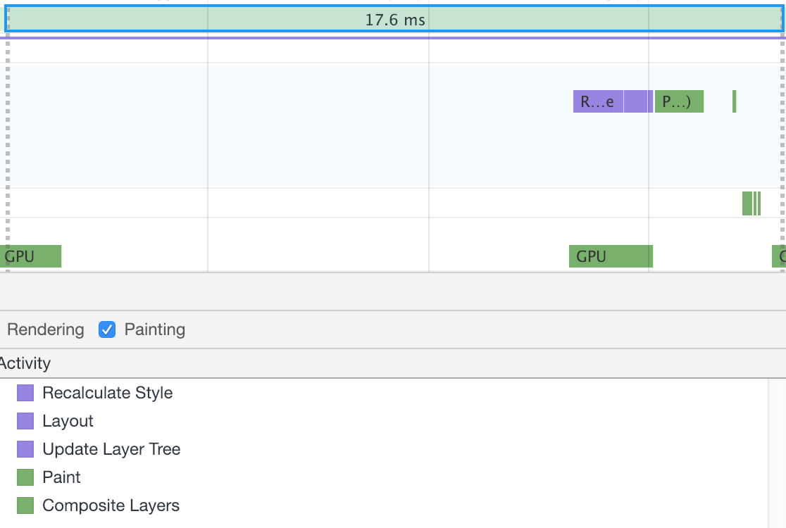
Here is a frame from our first version where we were animating the width and height properties:

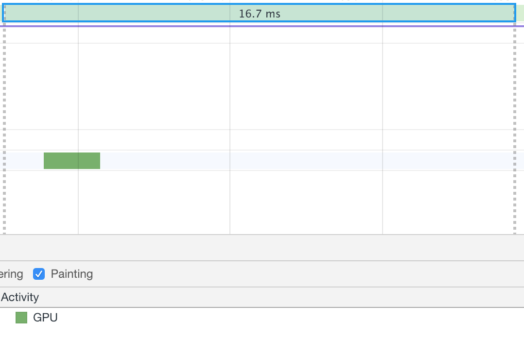
Note the Recalcalculate Style process in the activity list and the other cascading processes it triggered. Now let's look at a frame from our updated version with the transform property being animated:

Zero work on the main thread. 👌
Part 2: Adding the content
Scaling issues
We had mentioned that adding a scale transform isn't exactly the same as changing the width. This is because all the child elements also get scaled. Let's add content to the box and see what this behavior looks like:
See the Pen Stripe - Main Navigation 2.0 - Scaling content by Lokesh Dhakar (@lokesh) on CodePen.
That's not going to work. Though we did get the performance win with the switch to transforms, we are going to have to rework out HTML structure.
Redoing the markup
Let's move the content outside of the box element which is being scaled. We'll create a new sibling element for the content.
Before:
<div class="box"> <!-- Has scale transform -->
  Content in here
</div>
After:
<div class="popover">
  <div class="content">Content in here</div>
  <div class="background"></div> <!-- Has scale transform -->
</div>
Now the scale transform applied on the background element will not affect the content. Both the content and background elements have been absolutely positioned and given the same dimensions, so when layered, they fit together nicely.
Adding the other content
We'll be transitioning between three different sets of content. In this step we add the markup for each.
<div class="content">
  <div class="section section-products active">
    ...
  </div>
  <div class="section section-developer">
    ...
  </div>
  <div class="section section-company">
    ...
  </div>
</div>
We absolutely position each of the navs so they overlap. We do this to set ourselves up for cross-fading between them. I've made all the navs visible below so you can see the positioning:
See the Pen Stripe - Main Navigation 2.1 - Content markup by Lokesh Dhakar (@lokesh) on CodePen.
Part 3: Animating between content
Cross-fading the content
To fade between content we apply an active class on the section we want to show and transition the opacity from 0 to 1.
See the Pen Stripe - Main Navigation 2.2 - Cross-fade content by Lokesh Dhakar (@lokesh) on CodePen.
Animating and positioning
To keep our demo simple, we're going to hardcode the size and position of the different nav sections, but you could get these values dynamically on page load.
// Hardcoded size and positions for each nav section
const dimensions = {
  products: { width: 490, height: 280, x: 0 },
  developers: { width: 390, height: 266, x: 100 },
  company: { width: 260, height: 296, x: 200 }
}
We'll use what we learned earlier about transforms and apply them to the background box and the
content elements.
- For the background, we'll use
translateX()to move horizontally andscaleX()andscaleY()for adjusting the width and height. - For the content, we'll use
translateX()to move horizontally andopacityfor the fades.
// Resize and position background
backgroundEl.style.transform = `
  translateX(${ dimensions[section].x }px)
  scaleX(${ dimensions[section].width / originalWidth })
  scaleY(${ dimensions[section].height / originalHeight })
`;

// Position content
contentEl.style.transform = `translateX(${ dimensions[section].x }px)`

// Cross-fade content by toggling `active` class
sectionEls.forEach(el => el.classList.remove('active'));
document.querySelector(`.section-${section}`).classList.add('active');
See the Pen Stripe - Main Navigation 2.3 - Resizing the box by Lokesh Dhakar (@lokesh) on CodePen.
Part 4: Adding the top nav
The hard part is done! 😅
Now let's add a top nav and wire it up to show off our animations.
<nav class="nav">
  <button class="nav-link" data-nav="products">Products</button>
  <button class="nav-link" data-nav="developers">Developers</button>
  <button class="nav-link" data-nav="company">Company</button>
<nav>
navLinkEls.forEach((navLink) => {
navLink.addEventListener('mouseenter', (event) => {
let targetPopover = event.target.getAttribute('data-nav');
showSection(targetPopover); // Runs the resize, position, and fade code from the prev section
});
});
headerEl.addEventListener('mouseleave', () => {
hide();
})See the Pen Stripe - Main Navigation 4.0 - Add nav bar by Lokesh Dhakar (@lokesh) on CodePen.
Part 5: UI polish
Adding a 3d swing when opening
/* Set `perspective` property to enable  3d space. Header is the parent element. */
.header {
  perspective: 2000px;
}
.popover {
  transform-origin: center -100px; /* Axis moved up to create a larger arc of movement. */
  transform: rotateX(-15deg);
  transition: transform 0.3s;
}
.popover.open {
  transform: rotateX(0);
}
The version on the right introduces the 3d rotation on open:
Adding an arrow on top
To create the arrow, we take a square, rotate it 45 degrees and place it behind the background layer.
With the arrow added and the 3d swing effect in place, we get our final result...
🏁 Stripe.com morphing navigation
See the Pen Stripe - Main Navigation 5.1 - Add arrow by Lokesh Dhakar (@lokesh) on CodePen.
I hope you enjoyed this post and learned something new. If you did enjoy it, check out the full listing of posts for more from the Dev series.
And send me your thoughts while they are fresh in your mind. What parts did you like? What parts were confusing? What would you like to learn about next?
And lastly, follow me on Twitter to find out when the next post is up.